Apple Watch review: a status symbol for iOS devotees
original article from: http://www.engadget.com/2015/04/30/apple-watch-review/
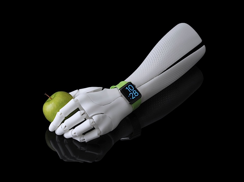
Mankind’s fascination with watches capable of more than simply telling the time is nothing new. But recently, our collective interest in intelligent timepieces has spiked, and we have more and more powerful wrist-worn computers to choose from than ever — whether made by startups with record-setting Kickstarter campaigns or the biggest names in consumer electronics. Of course, the biggest name of all, Apple, had yet to release one of its own. Well, the Watch has arrived, and its maker has loftier aspirations for it than the smartwatches preceding it. Apple’s Watch isn’t some utilitarian gadget — it’s jewelry, an object of lust, not only for what it can do, but also for how it looks.
I’m not a watch person. Haven’t worn one regularly since high school (I’m 33 years old now), and have never been enamored with the likes of Rolex or Longines. But the Apple Watch is, of course, much more than a mere time teller, and the company expects to sell a lot of these things to people like me — you don’t build a $700 billion company selling niche products, after all. The question is: Why would someone like me want one?
engadget points 79
Pros
- Finely crafted hardware
- Strong app support
- Lots of personalization options
- Easy-to-use fitness tracking
- Best smartwatch available
Cons
- Third-party apps can feel sluggish
- Some users will crave more control over notification settings
- Expensive
Summary
The Watch is the nicest smartwatch available, but it’s more status symbol than wearable revolutionary. Most of the Watch’s features can be categorized as nice to have (at best) or superfluous (at worst). As such, if you’re not enamored with the Watch’s appearance, it’s probably not compelling enough to buy one.
Hardware
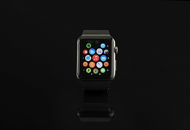
For the uninitiated, there are two sizes (38 or 42mm) and three Watch models: Sport, Watch and Edition. The entry-level Sport model starts at $349 and is made of aluminum, while the high-end Edition starts at $10,000 and is crafted of 18-karat rose or yellow gold. Apple loaned me a 42mm stainless steel Watch model ($549) with a bright, lime green Sport Band ($49 when sold separately) and a Link Bracelet ($449).
In keeping with its aspirations to luxury jewelry and with Apple’s usual obsessive attention to detail, the Watch case I received is constructed of machined, cold-forged steel polished to a high gloss. Its OLED screen on top and heart rate sensor on the bottom are sheathed in sapphire crystal, a material familiar to any luxe timepiece aficionado. (Note: Sport models make do without the sapphire protection.) The “Digital Crown” on the right edge is machined and polished too, as is the button with an ever-so-slightly chamfered edge alongside it. All of these elements are fitted together perfectly, with uniform gaps and nary a blemish to be found. The result is a watch that looks the part it’s been cast to play — assuming you dig the aesthetics of a rounded rectangle parked on your arm.
It’s the finest construction of any smartwatch I’ve seen, and none of the others are particularly close (second place: ASUS ZenWatch). More importantly (for Apple), it doesn’t feel ridiculous to compare its build quality to something made by Tag Heuer or Cartier.
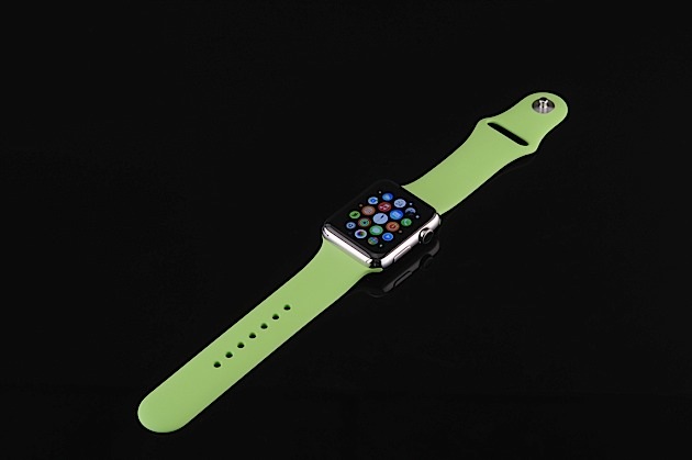
The Sport Band is made of a pliable, soft-touch material called fluoroelastomer and can be had in white, blue, pink and black in addition to the green I received. The Link Bracelet’s made of brushed stainless steel (a Space Black Stainless Steel Watch and matching bracelet are also available, though the black bracelet isn’t available for purchase separately). There’s a plethora of other straps available for the Watch made of metal and leather, as well.
While I’m not wild about the color of the Sport Band I’ve been using, the green cuts a striking image on my wrist, and has garnered my Watch far more (favorable) attention on the street than when I’ve worn the metal bracelet. As you might expect, the rubbery Sport Band is the more comfortable of the two, and even though it’s a more casual look, I am impressed with its fit and finish; there’s not a seam to be found on the thing, which keeps it looking and feeling premium (for a rubber strap).
Meanwhile, the Link Bracelet is a marvelous bit of engineering, with a unique quad-hinged clasp that latches and releases with rifle-bolt precision. It also has links that can be removed with a simple button press, which makes fitting the bracelet a relatively painless process. Pressing the release button while pulling on the appropriate links required more fiddling than I expected, but it also gets easier the more times you do it. The bracelet is comprised of a single band of horizontal scales, which sets it apart visually from the three or four vertical bands of links in most other watch bracelets. The effect reminds me of the scales you find on the belly of a snake, and I dig the simplicity.
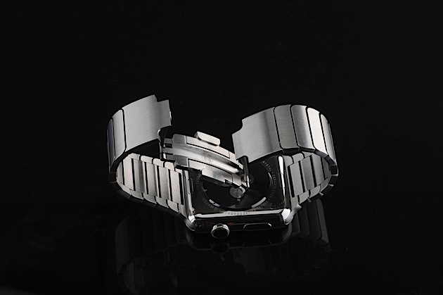
When combined with the polished steel Watch case, however, the brushed finish on the bracelet looks incongruous to my eye. Not to the point of distraction, but for a company that so sweats the little things like Apple does, I’m surprised that such a choice was made. At least it matches the bracelet in its precision construction, and the two fit together almost seamlessly.
Getting started
Setting up the Watch is straightforward. Upon powering it up for the first time, it’ll prompt you to pick a language, then open up the Watch app — which is included with iOS 8.3 — on your iPhone 5 or later. Tap the ‘Start Pairing’ option on your Watch and a dancing point cloud (think of it as a beautiful QR code) appears. Point your phone’s camera at the Watch’s screen, and once the point cloud forms itself into a circular rosette, presto! You’re paired. Then, you’ll need to agree to the terms and conditions, link up your Apple ID, create a Watch-specific passcode and let it sync all of the compatible apps and info with your iPhone. The whole process takes less than 10 minutes.
Apple’s Watch display is an OLED unit which, in the 42mm version has a 390 x 312 resolution that performs well in just about any lighting condition. Colors are vibrant; blacks are inky; and it’s viewable in direct sunlight, despite washing out (as is the case with every screen I’ve ever used in such conditions).
The default mode for that screen is off, but it wakes up when you either touch it or twist your wrist so the Watch thinks you’re looking at it. Much digital ink has been spilled about the split-second delay between raising your wrist and seeing the time, and it is noticeable, but I found the slight impediment didn’t bother me. The bigger issue is when the first arm motion fails to trigger the display, which forces you to either repeat the process or tap the screen to wake it up.
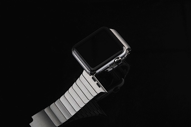
Should you have more than one Watch band to choose from, swapping them is a similarly easy affair. On the underside of the Watch sit two-flush mounted buttons that serve to release each side of the band, and those buttons need only be depressed slightly, if deliberately, to release. Sliding the ends out of the channels milled into the top and bottom edges of the Watch in which they reside isn’t hard, although doing so smoothly took a few tries before I got the hang of it. Also, re-inserting the Link Bracelet requires sliding the tip of one side in before seating the other and pushing them both in simultaneously. Once you feel a muted “snick” on both sides, your band of choice is secure.
The mechanism is brilliant in its simplicity and execution, and makes swapping straps a far simpler process than the pin system on your standard watchband or a trip to the jewelers. Given the wide selection of straps Apple is offering out of the gate (and with more to come, no doubt), this feature is of greater importance than you might think. Any wearable device aspiring to be fashionable has to look good, and the ability to tailor colors and styles to taste so easily is key to the Watch’s appeal. (And, in what I’m sure is a completely unintended side effect, this portends greater commercial success — buying multiple bands makes less sense if you have to head to the nearest jeweler to change them.)
But tailoring the physical look is only part of the equation. Apple has built in digital personalization options, too. The company has put together a user guide that comprehensively elucidates all that the Watch can do, so for the purposes of this review, I’ll stick to the highlights.
In use
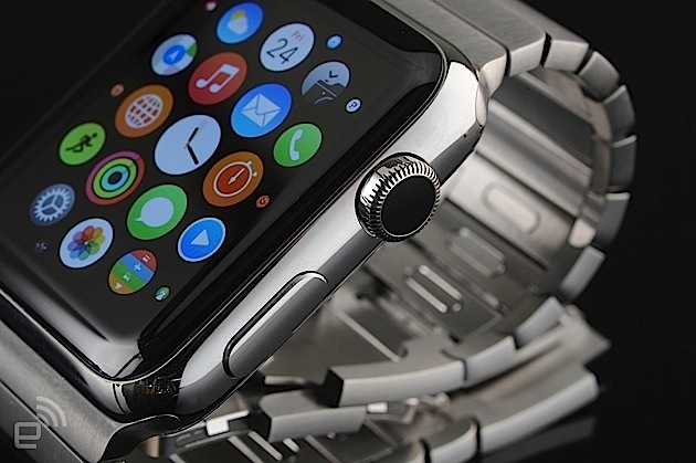
Generally speaking, the modes of interaction on the Watch’s user interface are straightforward, if not always intuitive. In keeping with its primary function, your homescreen is, naturally, a watch face, with the app launcher cloud hidden a layer below. Accessing it is a mere press of the Digital Crown away. Press it again and you’re taken back to your watch face. I found it helpful to think of depressing that crown as a sort of analogue for the iPhone’s home button, as double-clicking it also takes you straight back to the last app you’ve used. Scrolling through options and zooming in and out with that little knob made perfect sense from the start — I’m all about reducing fingerprints on shiny gadget surfaces, and the crown helps curb those smudges.
Another unique bit of UI comes in the form of Apple’s new Taptic Engine, a linear actuator that delivers haptic feedback. Far from a mere buzz or vibration, the engine delivers more detailed and nuanced tactile feedback, that in effect is not unlike Immersion’s HD haptic technology. Differentiating between the sensation of the different sorts of taps and rumbles it provides isn’t easy at first, but the more I felt the feedback, the more attuned I became.
Aside from the watch, app tray and individual applications, the Watch comes with a feature called Glances. A swipe up on the watch face drops you into a carousel of widgets for various apps and functions to let you get a quick look at battery life, the weather, or scores from teams you follow. You can add and subtract Glances in the companion iPhone app, though the only one I really found useful was a status screen that shows if the Watch is connected to your phone and lets you toggle airplane, do-not-disturb and silent modes. You can also ping your iPhone if you’ve misplaced it.
While the UI does take some getting used to, I settled into using the Digital Crown/touchscreen combo after a couple of days, and after a week, using the Watch became second nature.
Timekeeper
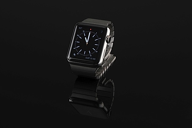
The Watch comes with 10 faces preloaded, and each can be adjusted to varying degrees. There’s also a creation engine that lets you make and save variations of those faces for quick access. To swap or tweak one, you’ll need to utilize Force Touch, Apple’s recently introduced tech that enables the Watch’s display (and the new MacBook’s trackpad) to distinguish a light tap from a hard press. Jamming your finger into the screen isn’t necessary, but you do need to apply significant pressure for the Watch to recognize what you’re trying to do.
Upon force pressing, the Watch gives you a horizontal carousel of the available faces. Swiping left and right gets you where you want to go, and any faces that can be customized have a button telling you so beneath them. Tap that button, and again, swiping right and left navigates the modes of adjustment. There are two main ways to tailor the faces: first, color. Wind the crown from top to bottom, and the hue of the words, numbers and watch hands change from salmon pink, to purple, blue, green, yellow, orange, red and finally, white.
Next, you can adjust a series of widgets on the faces, called complications in watchmaking parlance. Depending upon the face chosen, you’ve got three to five complications to work with. Tapping on a given widget lets you change it, and turning the crown rolls through the options. These include: date, calendar events, moon phase, sunrise and sunset times, weather, stocks, activity summary, alarm, timer, stopwatch, battery charge and world clock. Fans of simplicity can also turn any and all complications off.
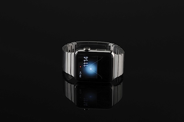
Additionally, the Motion face lets you choose among beautiful animations of different butterflies, flowers or jellyfish, while the Chronograph lets you change the watch face itself to black, navy, brown, forest green, dark gray or parchment color.
Two of the faces I found most appealing, Solar and Astronomy, don’t support such modding. They are, however, interactive and dynamic. Astronomy lets you swap among views of the Earth, the moon and the solar system (and spinning the crown lets you zoom forward and backward in time, spinning the celestial bodies and the sun’s shadow accordingly). Solar displays the sun’s position in the sky via a parabolic arc and horizon line and similarly, rotating the crown slides it along that arc. As it does so, the corona emanating from the sun changes to emulate the lighting of dawn, dusk, high noon and all other times before and after solar midnight.
Communicator
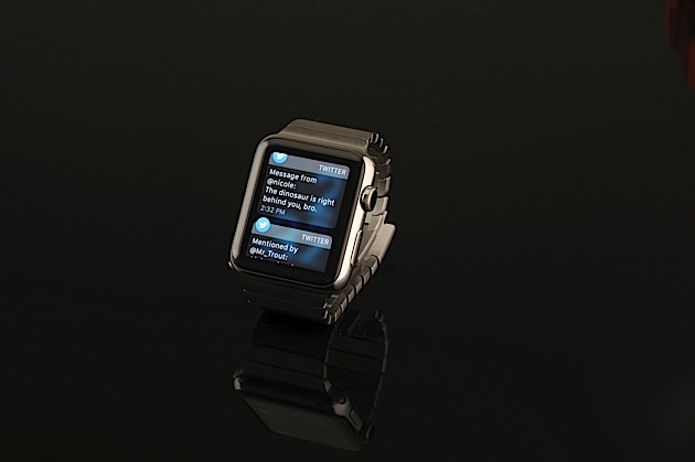
Some notifications are also actionable — such as archiving Gmail messages — though most are simply informational. Each is accompanied by a short pop or ding and/or a bit of haptic feedback. Both the sounds and vibrations can be turned on and off individually to suit your tastes or differentiate between types of notifications. Should you miss an alert when it first comes through, the next time you check the Watch, a small red dot appears on screen (or not, if you choose to turn that feature off) letting you know. A swipe down puts you in the notification tray, and if you want to dismiss all of them at once, a simple Force Touch does the trick.
Plenty of others have complained about a lack of granular controls for notifications, but I didn’t find it to be a problem. Really, having notifications mirror behavior from the iPhone or simply switching them off was all the control I needed. It’s just a matter of figuring out what sorts of pings you want on your wrist: just the important stuff, or a fire hose of info.
You can make and take phone calls, send and receive text messages or use Apple’s Watch-specific Digital Touch comms technology to send finger paintings, taps, animated emoji and even a facsimile of your heartbeat to your closest friends. Using the Watch to take calls is a middling-to-poor experience, though being able to mute an incoming call by covering the Watch is a handy feature. In a quiet, private place, it’s a “good enough” sort of thing, with mediocre audio at limited volume being pumped out of the Watch’s speaker. In public? Forget about it. Aside from the obvious lack of privacy and inconsiderate nature of forcing those around you to endure your conversation, you can’t hear what the person on the other end is saying when there’s any sort of ambient noise. The novelty of talking and listening to my wrist dissipated after just a few calls.
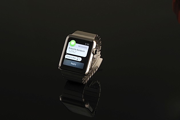
Messaging is, by far, the most useful of the Watch’s communication abilities. Using the app, you can receive, reply to and send texts, and Apple’s made replying to messages, in particular, even easier than on an iPhone. See, the Watch provides a list of (mostly) contextually relevant replies you can simply tap to use instead of typing out a response. You can also use Siri to dictate text replies or send audio messages — the voice dictation mostly works well, but plenty of times, there’s an interminable delay (sometimes of 15 seconds or more) between when I’d speak my reply and when Siri would recognize it. Still, I found messaging via the Watch a feature worth having, as it was often more convenient to deal with texts there than on my phone.
Apple’s made much ado about its Digital Touch technology, which, in theory, provides a more personal way to communicate. The tech enables you to tap, draw pictures or scribble words on the Watch screen and have it mirrored on your friend’s Watch, even if it’s a world away. You can also send your heartbeat by pressing and holding two fingers against the screen for a few seconds. In order to digitally touch someone, they also need to be added to your Friends circle in the iPhone app. In practice, I found it difficult to find the appeal of this mode of communication. I’m a poor artist; my handwriting looks like chicken scratch; and nobody would ever accuse me of being a romantic. Plus, I only had a couple of other Watch owners available in my contacts with which to experiment.
Fitness and health tracker
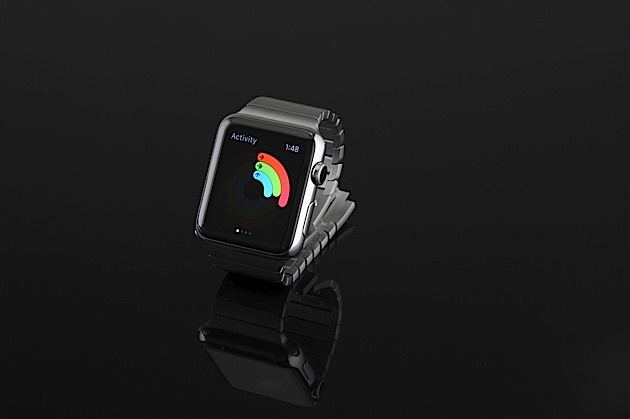
Despite my svelte frame, I’m no workout warrior. In fact, I’m one of the laziest people I know. (I will not apologize for this. Gormans are naturally a tall and skinny people.) Because of this, I greatly appreciate Apple’s multi-pronged, relatively frictionless approach to activity tracking. When first firing up the app, it prompts you to input your sex, age, weight, height and general activity level in terms of daily calorie burn. The app uses this information to recommend daily movement and exercise goals that can be adjusted manually as well. The app tracks you three ways using the Watch’s accelerometer: Move, Stand and Exercise. The aim is to give a comprehensive look at your daily activity and motivate you to stop being such a slothful meatbag.
Move is a calorie counter. Stand tracks how sedentary you are on an hourly basis (and prompts you to get up for at least one minute out of every hour). Exercise keeps up with how much time you’ve spent on any activity as or more strenuous than a brisk walk, with the aim of getting 30 minutes of exercise each day. I can’t say the Activity app has made me become more active, yet, but it has made me mindful of my activity level (or lack thereof) — and therefore I aspire to be more active. Baby steps, right?
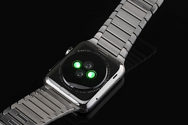
There’s also a separate, more comprehensive Workout app that integrates with the Activity app. The app lets you choose from a set list of types of exercise (walking, biking, elliptical, rowing machine, etc.). It uses that information, plus the accelerometer and heart rate sensor in the Watch, along with the GPS and WiFi in your iPhone to measure distance covered and (if you have an iPhone 6) elevation gained and lost. All those elements working in concert enable the Watch, according to Apple, to compute a more accurate estimate of your calorie burn during workouts.
Navigation, payments, music and more
There are a few other miscellaneous features of the Watch that are of particular value, I found. First among these is Maps. Issues with Apple Maps itself aside, the implementation of it on the Watch is quite useful, especially when used in tandem with the iPhone. While you can search for locations using Siri on the Watch, I found it preferable to map my routes using my phone and then let the Watch handle telling me where to go. It does so with visual cues and haptic feedback. The tap pattern is different for right and left turns, though apparently my tactile perception is pretty weak at this point. I’ve yet to tell the two apart by feel alone. I imagine they will become easier to differentiate as I grow attuned to the sensations.
Apple Pay is also, of course, a part of the Watch experience. You add credit cards through the iPhone Watch app — and even if your iPhone already has Pay activated, you’ll need to re-add your card for the Watch — and you must have a four-digit Watch passcode enabled. Using Pay is easy. Once you’re set up, press the lone button on the Watch twice and your available credit cards pop up on screen. Choose the one you want; hold your wrist near the reader until you hear the beep; and you’re good to go.
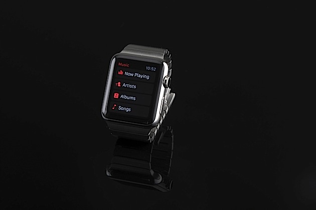
The Watch also lets you store up to 2GB or about 250 songs on board, though you’ll need a Bluetooth speaker or headphones to actually, you know, listen to those tunes.
Lastly, a word about third-party Watch apps. I’ve only tried a handful of the over 3,000 available, but the ones I have used are buggy and slow. I’m chalking this up to them being built for a wholly new software platform and developers need some time to optimize them. I therefore don’t find it necessary or useful to spend time evaluating them here. I will say that it bodes well for Apple to have such a huge catalog of apps at launch, and I expect to see more and better software in the months to come.
Battery life
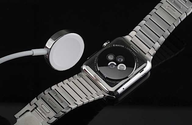
I’ll admit, coming into this review, I expected that having to charge the Watch nightly would be a chore. I was wrong. Because of the nifty magnetic induction-charging disc and the fact that I’d never sleep wearing a Watch anyway, charging it up each night just isn’t a big deal. (Though having to pack one more charging cable in my bag when I travel is certainly an irritation). As for battery life, well, I’ve made it through every day with at least 15 percent and sometimes over 50 percent of charge left when I hit the sack. Most importantly, I never once found myself worrying about the Watch running out of juice and never had to use the power reserve mode (which turns the Watch into a timepiece only) to make it through the day. Do I wish that the thing could last for days or weeks without a charge? Of course I do, but state of the art for smartwatch battery life is no more than a day — maybe two — and the Watch is in line with that despite packing a 205mAh battery just two-thirds the size of most of its competitors.
The competition
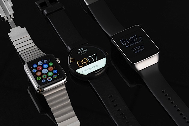
Mostly, the Watch’s competition comes from a plethora of Android Wear devices. When comparing software, the Watch does most everything that Wear does and more. Sure, Google Now ‘s contextual suggestions and voice recognition give it an edge over Siri, but the Watch’s customizable faces, with their nifty complications, are far more useful. Plus, Dick Tracy fans are sure to love the Apple timepiece’s abilities as a phone.
Yes, Samsung’s Gear S also makes calls, and matches the Watch Sport’s $350 price, but it’s huge, ugly and lacks app support due to its devotion to Tizen. The Moto 360 ($180) and LG G Watch R ($249) appeal to the circular-watch crowd, but both are masculine in appearance and are too chunky for those with feminine or dainty wrists. ASUS’ ZenWatch is only $200 and comes closest to the Apple Watch in terms of attractive design, but its massive screen bezel takes away from an otherwise handsome stainless steel body.
Really, if you’re smartwatch shopping, it boils down to the age-old question about the phone in your pocket: iOS or Android? Because if you want a Watch, you better be comfy as a resident in Apple’s walled garden.
Wrap-up
I don’t think the Watch is for me. While I appreciate the thoughtfulness, quality and ingenuity of the hardware design, it’s just not my style. Also, getting a Watch means locking one’s self into an iPhone universe, and while it’s an excellent handset, I harbor an affinity for Android phones. Plus, I rely heavily upon Google calendar and Gmail web apps both for work and personal purposes. Because of that, I can’t take full advantage of the Watch’s capabilities without switching to Apple’s calendar and email client. And that’s not happening.
However, there are plenty of folks picking up what Apple’s putting down, as evidenced by the estimated million Watch pre-orders Apple received. It’s a well-rounded wearable that handles notifications as well as any other smartwatch, has comprehensive activity tracking skills and the cachet of being the hottest device on the planet (for now). If you’re firmly on team iPhone, are willing to pay a premium for an intelligent timepiece and can handle charging it on a nightly basis, the Watch is for you.
The bottom line is: The Watch is the nicest smartwatch available, but it’s more status symbol than wearable revolutionary. Most of the Watch’s features can be categorized as nice to have (at best) or superfluous (at worst), and because of that, if you’re not enamored with the Watch’s appearance, it’s probably not compelling enough to buy one.
Photos by Will Lipman, 3D printed arm by 3D Systems
